Saturday, August 20, 2011

Little Guy Tie


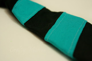
I went searching for a kids tie pattern online last week and this is the one I found over at Very Homemade. Her instructions were great, with fabulous step by step pictures! All together a great tutorial! 
I love the way it turned out, Charlie is such a stud muffin in his little guy tie! I can’t wait to make some more for him!
To get the stripes, I just cut out 3 long pieces of the turquoise fabric, ironed the sides under, and sewed them on diagonally before sewing the tie together.

I found it very helpful to iron each of the pieces between steps.
Here’s some more pictures of my little stud!


Hey look, mom, it's a chew toy!


This is my Clark Kent look.

Friday, August 19, 2011

Cold Brewed Coffee

As promised, here's my post about cold brewed coffee! I am so in love with it! I love the convenience of going to my fridge and pouring a glass of iced coffee, compared to brewing it and chilling it. Head over to my other blog to get the recipe!
https://thenotsoskinnybaker.wordpress.com/2011/08/11/cold-brewed-coffee/

Saturday, August 13, 2011

Little wooden jewelry box - DONE!

I finally finished the little wooden jewelry box! I actually got the painting done a couple weeks ago, but when I taped off the drawers, paint leaked under the tape, and there was a lot of touch up work to be done. So I finally got it done, and I got pictures taken. 
First I had to peel out the ugly velvet from the inside of the drawers. It was glued in with some crazy industrial glue, and was horrible to get out. I ended up chiseling away at it with a knife, and then soaking the drawers in water, and scraping the rest off. Once the drawers were dry, I painted the insides a pretty turquoise color. 
 I roughed up the outside with some sand paper, then wiped it down with a damp cloth. I taped off the drawers so that only the face would get painted. I stuffed the inside with balled up paper so it didn't get sprayed.
The handles came off pretty easily. To paint the handles, I stuck them through a piece of card stock, then gave them 3 coats of spray paint. They had tabs that go through the drawer, so it was easy to remove them and mount them to paint.
I didn't have any scrapbook paper I liked for this project. So I got on Google, found a design I liked, altered it, changed colors, ect, and printed it. Then I cut out pieces to fit the top of the dresser and inside the drawers, and Mod Podged them in place! I love the look of it. I can't believe that I never thought about printing designs to Mod Podge. Duh!

I love the way the jewelry box turned out. Emma seems to be fascinated by it.


Wednesday, August 3, 2011

Owl Mobile

I finally finished my owl mobile for Charlie's room! I got the paint chips to do it over a month ago. I just needed to kick my butt into gear.
I made myself a template, but instead of wasting my time tracing owls onto each paint card, here's what I did. I can fit 4 owls onto each card. So I cut each card in half, and then folded each 1/2 in half. Then I placed my template on the folded half, and cut around it. I cut my time in half by cutting out 2 at a time. I don't suggest doing more than that though, I tried cutting through 4 layers at a time, and the edges turned out really wacky. 

Once I had all my owls cut out, I used a hole punch for the eyes. I lined them up how I wanted them, cut out my strings, and then started gluing! I glued 2 owls back to back, with string in the middle. 

I absolutely love the colors I chose. The color palate was inspired by this gorgeous blanket my Sister In Law made for Charlie! I've started incorporating these colors into the theme of his room, I love them!


Tuesday, August 2, 2011

DIY Lightscoop Tutorial

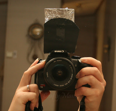
In a quest to better my photography skills, I came across a knifty little item on Elizabeth Halford's blog. It’s called a Light Scoop. After reading her posts about it, and seeing the before and after pictures, I knew I had to have one. I experimented with holding something reflective in front of my flash (a piece of cardboard covered in foil) but I couldn’t get it to stay in one spot while focusing on what I was photographing. So I google searched how to make a Light Scoop, and what do ya know, I found a tutorial! This is a great step by step tutorial on how to make a light scoop. To try it out, I just used cardstock (2 layers thick), some tape, and my handy dandy foil covered cardboard. I’m really hoping to make a more sturdy one at some point (you know, with a real mirror), but for now, this works. I can’t believe the difference it makes! Here’s some comparison pictures. My kitchen has HORRIBLE lighting, so I used it as an example. (P.s. I’ll get a tutorial up on how to cold brew coffee soon, it’s brewing right now!). 


In my poorly lit kitchen, ISO jacked way up, no flash.


With flash.


With the lightscoop.


Can you believe the difference? It looks as though I just knocked down a wall and let some light into my kitchen! I can’t believe how natural it looks. I think every photographer needs one of these. 


With the little bit that I’ve experimented with photography, my number one problem is lighting. My house just doesn’t have enough windows (or else it’s those gosh darned trees that surround all my windows!) and I always have horrible shadows and poor lighting. I can’t wait to see how much of a difference this will make with all the photos I take in the future. Here’s the tutorial I used, with a template for a Canon camera. 
Here's some more comparison pictures!
My crazy messy crafting desk, taken at nighttime in low light.

Also taken in low light at nighttime.